Prakerja.
About
Prakerja is an innovative platform dedicated to reducing poverty in Indonesia by providing accessible job opportunities, certification programs, and training. We recognize that limited access to work, careers, and education is a major factor in the country's poverty issue, particularly for productive-age individuals in both rural and urban areas. Our platform offers industry-recognized certification programs and a diverse range of courses and training opportunities, all supported through collaborations with the government, private sector, and companies.
Additionally, Prakerja features a job portal, connecting individuals with employment opportunities and helping them become job-ready. We believe that through these integrated features, Prakerja is making a significant impact on reducing poverty and empowering underprivileged individuals to contribute meaningfully to society, building on the success of similar government-managed programs like the MBKM platform.
UI / UX Lead
August 2023
Archive
Team
Ramzy Izza W. (Lead)
Ivanna Sihombing
Alexander S Detratama
Publication Link
9
Total Web-Pages
Challenge
The key challenge was to create an intuitive, accessible platform for users of all skill levels. Many users had limited digital literacy and were often unfamiliar with online certification and job applications. Additionally, the platform needed to be mobile-friendly, as over 70% of Indonesia’s population accesses the internet primarily through mobile devices. Ensuring ease of use while providing a wide range of educational and employment resources was central to the challenge. It was also crucial to ensure inclusivity for users from different socioeconomic backgrounds by offering affordable and relevant courses and certifications.
Responsibility
As the lead UI/UX designer, my role was to guide the redesign of Prakerja’s platform from a user-centric perspective. I was responsible for conducting extensive user research, developing wireframes, and ensuring that the final product was both functional and visually appealing.

Background of Study
User Research & Analysis: We conducted small user interviews and surveys to understand the key pain points and user needs. We also studied competitor platforms like Coursera and MBKM website to identify industry trends and best practices.
Competitor Analysis: Platforms like Ruangguru and SkillAcademy provided insight into effective learning experiences, particularly regarding the structure of courses and the integration of job portals.
Process
User Research & Analysis: We conducted interviews and surveys with 10 users, particularly focusing on underprivileged individuals, to understand their challenges in accessing education and job opportunities. In-app analytics were also studied to identify drop-off points in the user journey.
User Pain Points:
Difficulty navigating complex online systems.
Lack of clear instructions on how to enroll in certification programs.
Limited understanding of how to apply for jobs online.
User Persona:
Adi, 32, factory worker, looking to upskill but unfamiliar with digital tools.
Siti, 22, a recent graduate seeking her first job, primarily uses mobile apps.
User Journey: From visiting the homepage to successfully enrolling in a course and applying for a job, we mapped out all the touchpoints where users were facing friction and redesigned those pathways.
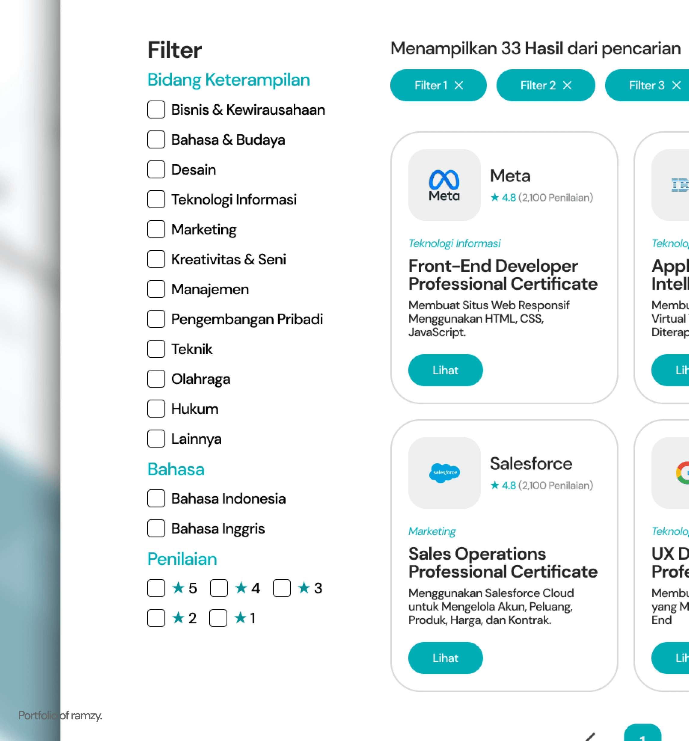
Information Architecture: Based on the research, we restructured the app’s navigation, placing the job portal and certification programs at the main page, simplifying the process for users to find and enroll in programs.
Wireframing & Prototyping: Low-fidelity wireframes were created and tested with users. Iterative feedback helped us refine the design into high-fidelity prototypes, which were later tested with a broader audience.
Visual Design & Style Guide: A consistent visual style was developed, featuring clear typography, accessible color schemes, and mobile-first layouts to ensure the platform was both easy to navigate and visually engaging.


Key Takeaways
This project underscored the importance of user-centric design, especially for platforms aimed at diverse and underprivileged populations. Testing early and often with real users provided critical insights that shaped the final design, making it more intuitive and accessible. Balancing the needs of a broad user base with technical constraints was a key learning point in this project.